Food Explorer

Project Overview
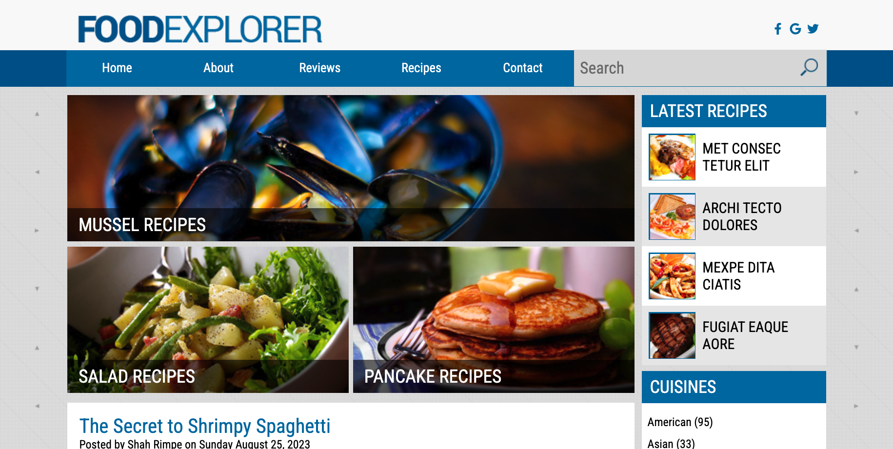
Food Explorer, a collaborative project crafted by a team of four, was developed using HTML, SCSS, and JS to replicate a designated mockup design. This website stands as a showcase of our proficiency in building both functional and aesthetically pleasing web applications.
Tool I Used
Development

I took charge of developing the header and ensuring its responsiveness, incorporating a hamburger menu and social media icons. Throughout the development phase, I consistently applied the BEM notation in SASS to organize CSS classes into distinct blocks, elements, and modifiers. This approach facilitates better codebase management and maintenance.
Highlights

The main goal of this project is to develop a website named Food Explorer that closely mirrors the given mockup design. The website aims to showcase our expertise in employing HTML5, SCSS, and JS to create web applications that are not only functional but also visually appealing. Furthermore, teamwork and collaboration are integral to the project, necessitating active contributions from all team members for its successful culmination.
What i learned
1
2
3
4
5
6
7
8
9
10
11
12
13
14
15
16
17
18
19
20
21
22
23
24
25
     @media screen and (min-width: 500px) {
        .container {
           padding: 0 1rem;
        }
        .header {
          padding: 16px 0;
          &__grid {
            height: 50px;
            grid-template-columns: repeat(12, 1fr);
            grid-template-rows: repeat(2, 1fr);
            grid-row-gap: 7px;
          }
          &__logo {
            grid-area: 1 / 1 / 2 / 8;
            display: flex;
            align-items: center;
            z-index: 100;
          }
          &__social-icons {
            display: none;
          }
          .burger-menu {
            display: none;
          }
ChatGPTEngaging in a project reinforced the significance of teamwork and collaboration for me. Through collaboration, I gained valuable insights from diverse perspectives and harnessed the strengths of each team member. Additionally, I honed my skills in HTML, SCSS, and JS, with a particular focus on implementing the BEM notation and crafting responsive designs using mixins and media queries.